Crowdsourcing the research article of the future
I will only publish one research article this year. This is the one!
NOTE: Mathieu Boudreau, Agâh Karakuzu and Pierre Bellec contributed to this post
Academic publishing is broken. Mainstream news outlets are declaring the scientific article obsolete, renowned scientists claim that research articles are just advertisements for the actual scholarship, forward-thinking enterpreneurs are realizing that pretty soon papers will be written by nobody for nobody, and literature search experts are saying that close to nothing of what makes science work exists as text on the web. Large language models are amplifying the validity of the above statements. Advances in AI are making it easier to write authoritative prose, and scientists are realizing that they need to go beyond text and conventional publishing if they want to make their science count. This is particularly true of biomedical sciences, where research is data-driven and computationally intensive.
When you strip a research article of its prose, what remains are the figures, the data, and the provenance. The first two remnants can be easily manipulated, as has been demonstrated in recent retractions by prominent scientists who generated fake data and images. And while outright fraud is rare, many scientists engage in creating misleading figures, introducing a so-called lie factor (defined as the effect size in the graphic divided by the effect size in the data). This lie factor can be virtually eliminated by publishing the figure provenance, i.e. by tightly integrating the figure generation with the underlying data. However, provenance cannot be incorporated in a static PDF. That is why we have created NeuroLibre, a living preprint server that hosts interactive research objects and replicates the runtime environment necessary to generate the figures and to trace their provenance.
Over the past three years, we have been working on our flagship NeuroLibre publication, and I can proudly say that it is finally here. 42 co-authors, 94 datasets from 18 sites, 5 interactive figures, and an award-winning dashboard, all bundled in our most ambitious NeuroLibre preprint yet:
https://preprint.neurolibre.org/10.55458/neurolibre.00023/
A joint effort between two study groups of the International Society for Magnetic Resonance in Medicine (Reproducible Research and Quantitative MR), this preprint presents the results of the T1 mapping reproducibility challenge. At the link above you can access a PDF of this preprint, interact with a Jupyter Book of the manuscript, and re-execute everything in the browser using Binder (just click the little rocket in the upper right corner here).
We also built an interactive dashboard to explore the phantom and human datasets and analyses. The dashboard (also hosted by NeuroLibre) won a recognition from the company Plot.ly for its innovative visualizations. Check it out:
SO WHAT DID WE DO?
Challenge participants acquired T1 datasets using the ISMRM/NIST qMRI phantom (produced by CaliberMRI) and/or human brains using a gold standard T1 mapping protocol. Participants were only given the PDF article where the protocol was published and told to proceed as they see fit. This work was selected as one of the top 50 abstracts at the 2023 annual ISMRM meeting in Toronto #ismrm2023 #ismrm23
Here's a video recording of the presentation and eight take-home points taken from a recent Twitter/X thread:
1/8 CROWDSOURCING THE T1 COMMON GROUND
Now that we showed off the format, time to tell you why this work is important and why it is the only research paper I will publish as senior author in 2023.
But first, a big thank you to joint first authors Mathieu Boudreau and Agâh Karakuzu!
2/8 A PDF IS NOT ENOUGH TO IMPLEMENT A PROTOCOL
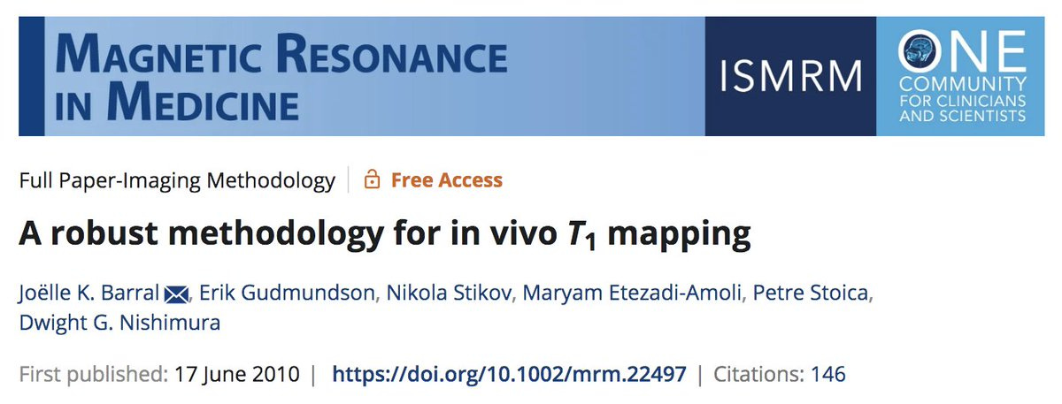
Even though everybody implemented the same T1 mapping protocol (Barral et al.), the variability was twice as big across sites than within a single site.
This shows the impact of implementation variations across data submissions!

3/8 YOU CAN CHECK IT OUT FOR YOURSELVES
Using this interactive Plot.ly figure we can compare against the phantom reference values and zoom in to identify outliers.
4/8 QUALITY CONTROL IS ESSENTIAL FOR REVIEW
For quality control, in addition to showing different phantom T1 maps submitted by participants, we gain additional insights by using a dropdown that displays the images at different inversion times.
5/8 DASHBOARDS ARE THE FRIEND YOU DIDN'T KNOW YOU NEEDED
Additionally, we acquired in vivo brain T1 maps. Using our @plotlygraphs dashboard, you can easily switch between measurements to focus on specific regions, sites or vendors.
6/8 KEEP THE LIE FACTOR TO A MINIMUM
With the click of a button, you can change the axis units (eg, % vs. absolute) or the grouping (individual sites vs. vendors) in the statistics section of the dashboard while you’re reading the manuscript.
7/8 VALIDATION IN PHANTOMS IS NOT ENOUGH
A comparison of in vivo white matter at 3T and the NIST phantom sphere that is closest to white matter T1 values at 3T. Variability in phantoms is much smaller than in vivo.
8/8 WHY I WILL NOT PUBLISH ANOTHER RESEARCH ARTICLE THIS YEAR
It took me eight years to publish my first article. This one took only three years, so I believe I deserve a break:)
P.S. I would like to thank Mathieu Boudreau, Agâh Karakuzu and Pierre Bellec for the countless hours they have put into NeuroLibre, and for their help in putting together this manuscript and this Substack post. For a more technical explanation of what we have accomplished, here is a snippet from a popular Mastodon post, courtesy of NeuroLibre co-founder Pierre Bellec:
https://neuromatch.social/@pierre_bellec/111250741252232026
This NeuroLibre preprint is probably unlike anything you've seen before. The science by Mathieu Boudreau, Agâh Karakuzu and a large team of collaborators is fantastic, but I'm talking about the tech used for the preprint itself here. First it's not just a lame pdf preprint. It's got an html version filled with interactive figures, and even a dashboard! But that's not what's unique. What really matters is that it is fully reproducible, and has been tested for it. By clicking on the small rocket, you can reproduce the figures yourself, from your browser. All the data, all the code, all the dependencies have been published alongside the preprint, and the figures have been generated by the neurolibre servers, not by the authors! Each reproducibility artefact has its DOI, and they are cleanly linked to the DOI of the preprint. It is indexed by Google Scholar, Orcid and the like. Neurolibre is based on the amazing Jupyter Book project, and authors can do 99% of the work themselves just by using Jupyter Book and the Neurolibre technical docs. The technical screening of the submission is automatized to a very large extent (it's been adapted from the awesome workflow of the Journal of Open Source Software). Check the publication process out, it's on GitHub!
This project is part of the Canadian Open Neuroscience Platform, funded by Brain Canada and several partners, including the Courtois foundation, the Montreal Heart Institute, the Quebec Bioimaging Network and Cancer Computers.


